I'm a longtime fan of anything letterpressed, and while I've been making posters and doing other design for years, there are a few tangible design mediums I haven't yet had a lot of experience with. Letterpress is one of those, and the other week I finally got a chance to see the process in person (and even help out a little bit!).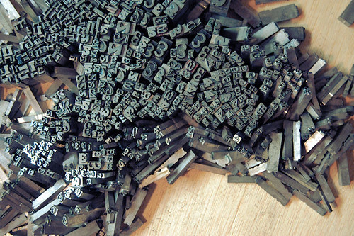
Beautiful Angle is a letterpress studio in Tacoma, WA run by Lance Kagey that's constantly turning out really wonderful stuff. Once a month, Lance and writer Tom Llewellyn (along with friends and collaborators) make a run of posters to put up around Tacoma. On top of the monthly Beautiful Angle posters, Lance often does posters for events in the area. I got a chance to look through the huge backlog of posters they've built up while we worked on pressing some posters for upcoming Wintergrass. I couldn't help grabbing a few photos while down there...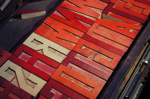
Some custom letters Lance designed himself.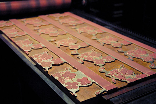
The portion of the Wintergrass posters we were pressing that night.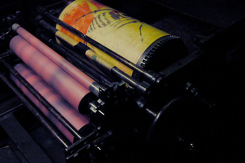
Lance's gorgeous vintage letterpress.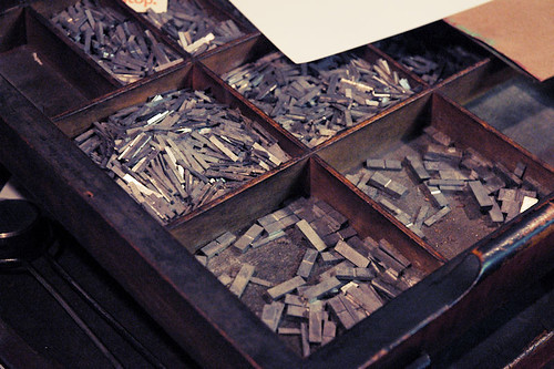
Letterpress is an art that's tangible in a way that many things in our lives aren't anymore. In such a digital age I find it refreshing to work with my hands and it helps me really appreciate the physical result of such a time-tested craft. I'm looking forward to spending more time with this medium in the future.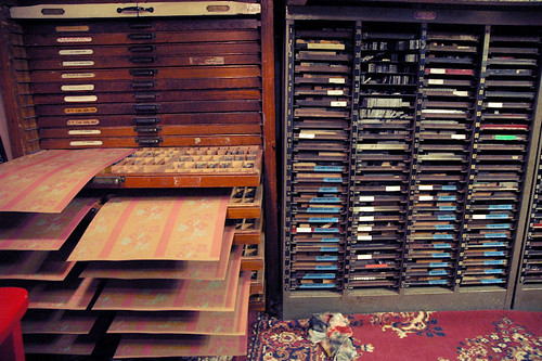
Posters drying.
And here are just a few examples of the work Beautiful Angle has done:


January 17, 2011
beautiful angle
January 13, 2011
vinyl art
I've recently had the opportunity to work in a new medium - plastic! I've been designing pieces made with computer cut vinyl which I can either apply to acrylic or glass as self-contained art pieces, or the vinyl can be applied to other surfaces like a sticker. It's more of a commercial medium than I'm used to but it's been a lot of fun to play around with and I have some vinyl-related projects in the works. Check back for more info on that soon... for now, here are a few of the things I've been making!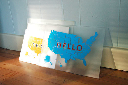
"Hello" - series of U.S. maps in different colors/patterns (these will be for sale soon)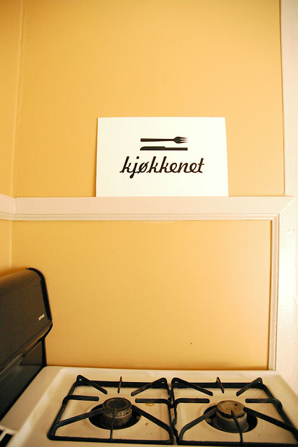
"Kjøkkenet" means "kitchen" in Norwegian.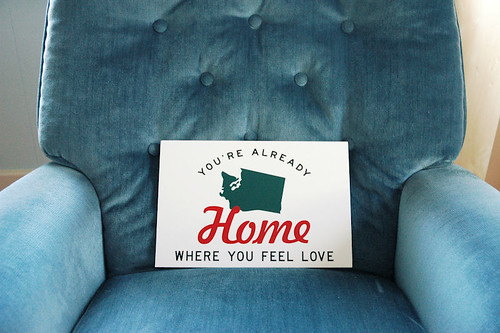
Words are from a song by my friends The Head and the Heart.
And Alex Crick got a great shot of one of the stickers I made, which you can see here. My friend Damien stuck it straight on his guitar!
Keep an eye out for upcoming vinyl projects...I've been working on some title cards in collaboration with a video project being put together by Tyler Kalberg and Dylan Priest, and I'm really excited to see the outcome. These guys do great work: Tyler shot the gorgeous Doe Bay Sessions (and check out Dylan's portraits from the sessions as well as his Vimeo) so it's gonna be good!
December 24, 2010
god jul / godt nyttår
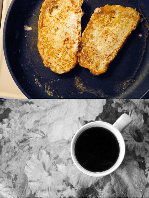
Wishing everyone a warm and happy holiday from my native North Carolina. Normally I try to keep this blog to art/craft and inspiration related to those things, but this is a special time of year for me, and I always like to reflect on the year gone by. I have thought a lot in the past few days about the significance of this season, about tradition, about the importance of cherishing time spent with loved ones, be it friends or family or in some cases both, and simply being grateful for everything that we have. 2010 was a rough year for many folks I know, but there was a lot of good that came out of it. I am always inspired by the ability of people to take something bad and turn it around into something good - something from which to draw experience and strength, something to inspire them to make good happen. I've watched it happen over and over again this year and I am so grateful for all the good that came to me in my dark times this year.
Winter is not known for being a bright season, but this year it is filled with brightness in my eyes. I no longer live close to my family and so I cherish my time with them like I never did before. Tonight I listened to my grandmother tell stories and was overcome by the urge to record them (something which I am now planning to do) - she always wanted to write a book but perhaps we'll have to do it for her. After dinner I went for a Christmas Eve walk around my old neighborhood. The air was crisp and smelled like woodsmoke and the neighborhood was quiet and filled with lights and I found myself wondering how anyone could not like this time of year. I ran into some old family friends on my walk, took a few photos, and went on my way. As I sit by the Christmas tree, I feel content and grateful. And ready to face a new year.
Merry Christmas to those of you who celebrate it, and a happy holiday and happy new year too.
December 6, 2010
inspiration: christian sorensen hansen
Seattle is so alive with creativity that sometimes my heart feels fit to burst. I am beyond impressed with the musicians and artists here, and these two videos by Christian Sorensen Hansen are a perfect representation of why. Be sure to check out both of these bands as well as Christian's other work -
International Filing Systems / Christian Sorensen Hansen
Bryan John Appleby
Campfire OK
Cliffs Along The Sea from Christian Sorensen Hansen on Vimeo.
Dreidel, Dreidel from Christian Sorensen Hansen on Vimeo.
November 29, 2010
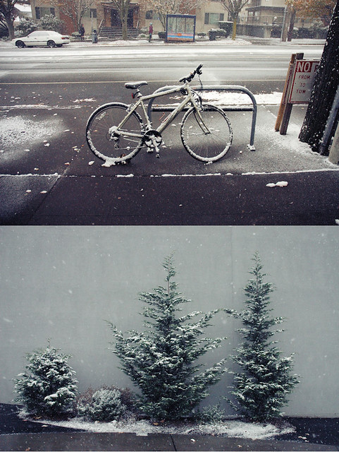
november

September 22, 2010
on garment construction and colorwork
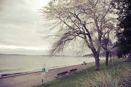
(Alki Beach, West Seattle)
The autumnal equinox was tonight, and as all knitters know, that means knitting season is officially open. For most of us, this means we crack down and get to work on knitting gifts for our friends and family the upcoming holidays, and if we're lucky, we'll knit one or two things for ourselves in the process. I have been daydreaming about knitting myself a Scandinavian-inspired sweater for ages now, stranded colorwork and all, so with fall rapidly approaching (and Christmas-gift-knitting around the corner), I finally decided to sit down and make myself the Scandinavian sweater I've been wanting to for years. Enter Skydottir: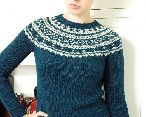
I knit this sweater without a pattern, which is a first for me, and so the bulk of this post is going to contain notes on how I decided to do what I did and what I learned about garment construction and designing knitwear. If that doesn't sound remotely interesting, feel free to skip the writing and just look at the pictures!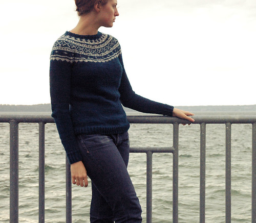
Going in, I had an idea in my head of what I wanted, but I couldn't find the right pattern. I knew I wanted a pullover with a seamless yoke construction - no steeking, no seaming, but with a yoke worked in stranded colorwork. I scoured ravelry, I checked out books and websites, but I couldn't find what I was looking for. I am notoriously stubborn, so I decided to combine my Scandinavian sweater project with the challenge of working up a wearable garment without using a pattern. Not only would I end up with the sweater I had envisioned, but it would be a valuable learning experience in the process. Feeding two birds with one seed, right?
Prior to Skydottir, I had knit two pullovers (one raglan knit flat and seamed, one bottom-up seamless yoke knit in the round), and one cropped cardigan. I knew I wanted to go with the seamless yoke construction, as the stranded yoke is the showcase of this sweater, so I took the basic principles used in that pullover pattern (which happened to be Kate Davies's Owls) and applied them to this project, which uses a different needle size and a different yarn weight. These techniques were:
- bottom-up construction, knitting first body, then sleeves, then joining all three to knit the yoke up to the neckband
- decreases and increases for waist shaping on the body
I also knew I wanted to do a 1x1 twisted rib at the waistband, neckband and cuffs of the sweater, because I think it's a really clean looking ribbing. So I started with the waistband, casting on for my twisted rib. And here's where I learned my first lesson, which is: SWATCH. Okay, I know, this should be a big duh. We all know the importance of swatching. But still, I thought I could get by just estimating, and somehow, I decided 80 stitches sounded right. Skydottir was worked on American size 9 needles with worsted weight yarn - I quickly discovered that 80 stitches was not going to make it around my waist. I frogged the one or two rows I had on the needles and got ready to start over. And yet I still did not swatch. On try #2 I overcompensated and cast on far too many stitches - at least 160, but I don't remember for sure. I worked up 15 rounds of twisted rib and an inch or two of stockinette before I realized my sweater was huge. I was frustrated, but I sat down and measured my gauge on my too-huge try #2 and used that to calculate how many stitches I really should be casting on by measuring my hips, subtracting two inches for negative ease, and multiplying my stitches per inch by that number. I frogged try #2, cast on for try #3, and the third time was a charm. It was smooth sailing after that.
While Owls uses a rather unique pattern of decreases and increases along the back of the sweater for the waist shaping, I opted to do my decreases and increases along the sides instead, visible here: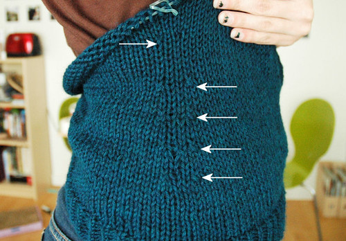
I had no trouble with the placement of the shaping - I spaced my decreases about an inch apart, gave about an inch and a half between the last decrease and the first increase, and went back to the one-inch spacing between each increase. I decreased four times and increased only two, knitting straight up to the underarm on the body. I wanted to keep it simple so I didn't do any short rows to dip the yoke or anything like that - the body stayed put until the sleeves were ready to be joined. The sleeves were also knit in the round, with fairly regular increases until they reached my upper arm. 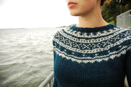
And then came the yoke! I had never knit a yoke with colorwork before, so I spent some time studying the stranded yoke charts of a few other sweaters to get an idea of where and how often to place the decreases. As far as I can tell, the key is to knit a round of one color before you work a decrease round, and when you decrease, you should use the same color as the round before. I worked up a chart for myself, borrowing motifs from both traditional Norwegian and Icelandic knitting.
Getting the bind off right took three tries as well - I kept binding off too tightly. Desperate to finish my sweater, I ended up trying Jeny's surprisingly stretchy bind off from knitty. It did the job (the sweater fit over my head) but it's not the prettiest bind off I've ever seen, so I'm in search of a cleaner-looking stretchy bind off for next time.
All in all, I'm extremely proud of Skydottir. There are a few things I would fix if I tried it again - I was aiming for a more fitted sweater than I ended up with, and the colorwork is a little wonky in places because the gauge requires a looser tension than I'm accustomed to - but the sweater is wearable, pretty, and just the sort of sweater I was hoping for. Yarn and needle details:
Main color: Berroco Vintage, worsted weight, colorway Tide Pool (5185)
Contrasting color: Berroco Ultra Alpaca, worsted weight, colorway Moonshadow (6209)
#9 needles (5.5mm), 24" and 32"
Oh, and the name Skydottir comes from my new favorite cookies, made in my favorite neighborhood in Seattle.
September 4, 2010
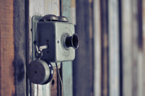
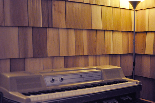
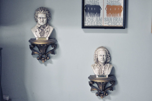
tiny telephone
I took a bunch of photos of the studio while I was there, and I'll post a few of them below. You can see the rest over at the Tiny Telephone tumblr page.
August 17, 2010
inspiration: chris mcveigh
I haven't had a proper "inspiration" post for awhile, but I came across Chris McVeigh's work yesterday and had to share. He's a graphic designer and a photographer and shoots a lot of different things (there's a lot of Legos and action figures on his photostream), but my favorites of his have to be the little Lego worlds he creates as well as the shots of chipmunks with Star Wars action figures. If I had to describe his work, I'd probably say it's ridiculous in a good way.
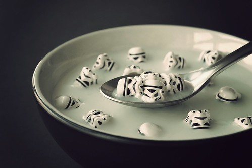
"A Balanced Breakfast"
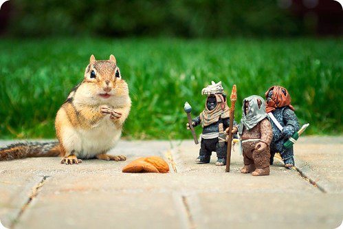
"I've Got a Bad Feeling About This"

"Business is Slow"
July 11, 2010
urban craft uprising, day 2
Day two of UCU was just as fun as the first - and today I had my wallet with me. I went with my friend Jess and James at 11am this time, when the fair opens, and much to my surprise, we were close enough to the front of the line to get swag bags! The goodies inside were totally rad, too. The combined contents of mine and James' bags:

1. Handmade vegan soaps, Estrella Soaps
2. Bottlecap pin from Tami Potts
3. Handmade glass bead, Hammer and Torch
4. Selected buttons, Creation Station
5. Gorgeous forest green ribbon from Midori Ribbon
6. Little sheep (!) pouch, Maluhia Designs
7. Needlework scissors from Pacific Fabrics & Crafts
8. Fabric buttons from Laura Bucci
9. Mega-super-adorable blue gingham buttons from Midori Ribbon
There was also a headband from Texture but I forgot to throw it in the photo (whoops!).
Pretty incredible freebies, to be honest. UCU does it right. And as for my purchased goods...

I'd say I did okay! In the back is a gorgeous print from favorite Jill Bliss. Also pictured: an adorable card from Sycamore Street Press ("Great job on that thing you did, really super!"), some iron-on patches and a wooden button from R and L, and a DAVID BOWIE NECKLACE! from Fable & Fury.
And as I mentioned, I collect a big stack of business cards as I go along, and you can see a few of the favorite vendors I've written about tucked in there:
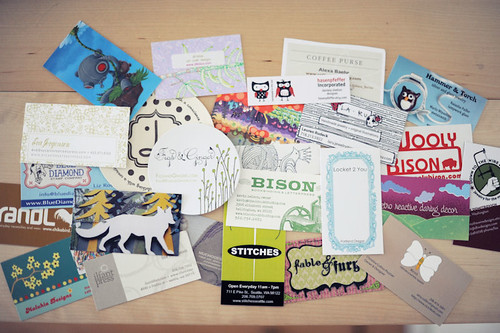
And speaking of favorite vendors, here's a few more additions to the list I started yesterday: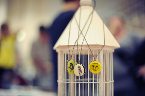


Locket 2 You
locket2you.com
These lockets were both adorable and amazing, and the folks are super nice. They're based in Portland and they rotate their designs seasonally, so there's always rad new designs on the way.
MuchoDesign
muchodesign.etsy.com
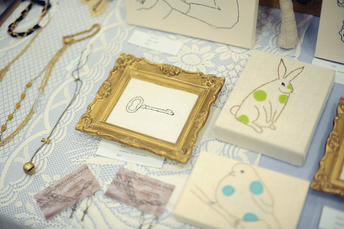
These guys had some stellar embroidered artwork and really, really gorgeous jewelry. If I remember correctly, much of the embroidered work was made with reclaimed textiles, which is really awesome. Also: embroidered Spock?! What's not to love?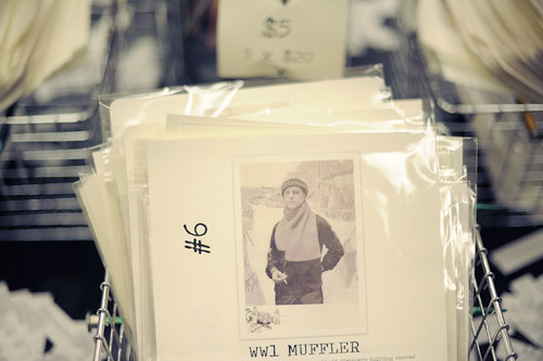
Princess of Patterns
princessofpatterns.com
Sarah's got a huge selection of gorgeous vintage knitting patterns available. Being a fan of both knitting and vintage clothing, I was swooning over her patterns just a wee bit...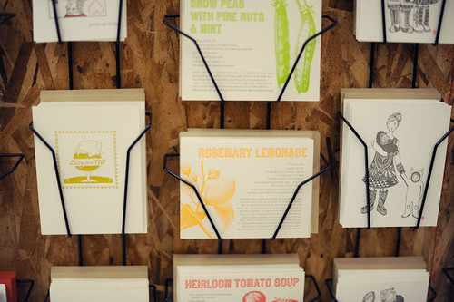
Bison Bookbinding & Letterpress
bisonbookbinding.com
These guys had some gorgeous cards but my favorite were the ones pictured above - letterpress notecards with recipes on the front!
And for good measure, here's a few more photos...
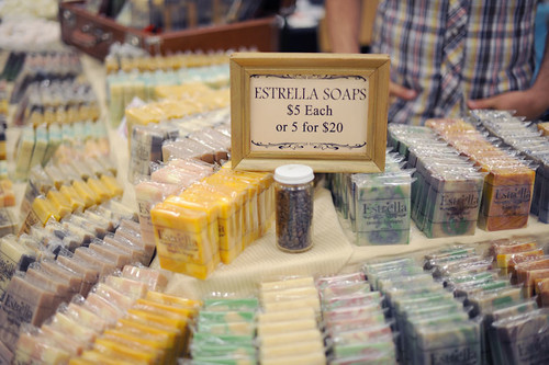
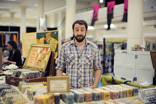
Brad slings Estrella Soap

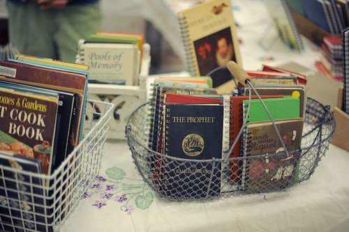
Jess peruses Attic Journals
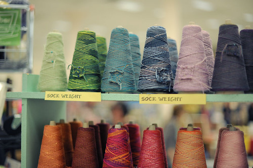
Gorgeous yarns from Yarnia
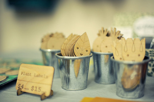
Adorable laser-cut wooden plant labels from RandL

Pretty little notebooks at the Jill Bliss booth
July 10, 2010
urban craft uprising, day 1
One of the largest craft fairs that happens here in Seattle, Urban Craft Uprising, is going on this weekend at Seattle Center. I got to go for the first time last December (they do a winter show and a summer show), and for anyone who has an affinity for the cute and the handmade, it is the ultimate collection of Stuff You Want to Buy. There are some mega-talented people selling stuff this weekend, and it feels great to be able to meet all the wonderful folks making rad stuff in the northwest.
I swung by today for a quick peek at who was selling, and I'm headed back tomorrow to make a few purchases. One of the great things about having all these amazing artists in one place is that you can start a collection of business cards as you make your rounds, stash them in a box, and then pull them back out when a friend has a birthday coming up or the holidays are coming or you just want to buy something nice for someone (or for yourself). As a designer, it's always really fun to see what folks do with their cards, too. I thought I'd share a few of my vendors this time around, starting with...
Jill Bliss!
jillbliss.com
I've actually been a huge fan of Jill's stuff for years now, so it was pretty thrilling to see a whole booth full of gorgeous Jill Bliss artwork, and to get to meet her too! She tends to illustrate plants and animals and natural things in some not-so-natural pastel shades which makes for a combination that is both striking and delicately pretty. 
Sycamore Street Press
sycamorestreetpress.com
I discovered these guys at the last UCU in December and I am such a huge fan of their letterpress notecards and prints. I was really happy to see them selling again this time around. Eva's business card is totally gorgeous, too - letterpress (of course) on a nice thick cardstock. It's a great card in that it totally represents what these guys are all about (which a good business card should do, truly). Somehow these guys are both chic and cheeky and it totally works.
Blue Diamond Stamp Company
bluediamonstamps.com
I love stamps, but somehow I'd never come across these guys. The coolest thing about Blue Diamond is that they sell acrylic stamps - the actual stamp is a clear polymer that sticks to an acrylic block. You only need one block for all your polymer stamps, so you save a ton of space on storage. Plus, the acrylic block is totally clear, so you can see exactly where your image is going!
I'll write about a few more vendors tomorrow, as well as share a few images from the event. If you're in Seattle, it's going on from 11-5 at Seattle Center!