Showing posts with label design. Show all posts

March 31, 2011

on home and community


Many people have a lot of pride for their hometown or their home state - I grew up in North Carolina and even though I haven't lived there for several years, I still carry around a little replica of the state's silhouette on my keychain. It reminds me to think about home. But there's more than one meaning to that one word: home. There's the home you came from, and then there's the home you choose. The home you make for yourself. The friends you surround yourself with who, while they may not be your blood relatives, are like your family. Washington state is that home for me, and I've noticed that folks around here have a lot of Washington pride (myself included). Seattle is a city with a pretty sizable population of transplants; I know plenty of folks who uprooted their lives and moved out here to take a chance on Seattle. And we may not have grown up with Mariners baseball or the Kingdome or Fisher and West on the radio in the morning, but we love this city all the same.

Last fall my friends Damien and Sarah were spending some time with me after they got home from tour. I'd started making my "hello" maps, and after Damien saw one and proclaimed "that's awesome!", he said, "You should make one that's Washington State and just says 'home.'" Friends, let this be evidence of Damien's genius.

Now, remember when I was talking about the home you choose, and the friends that are you like your family? Damien and Sarah are that for me. Without going into all the boring details, they were there for me at a time when I needed them immensely, and I wanted to give them something meaningful for Christmas. I remembered Damien's Washington "home" suggestion and came up with two things: the sign and the sticker you see below:


Damien put the sticker on his guitar. My friends immediately began asking for stickers and signs of their own. I only made nine signs, but I kept making stickers, and those are available via Luckyhorse Industries. As you can see at the top of this post, the graphic from the sign is now on T-shirts - the lyrics came from a song by our friends The Head and the Heart and they recently approached me about putting it on some shirts exclusively for their two upcoming Seattle shows. I was thrilled to oblige (and happily, Luckyhorse Industries also printed the shirts).

My friend Abbey from local music blog Sound on the Sound loved the WA home stickers so much, she got the design tattooed on her arm:


I have been trying to write this post for weeks now, and failing, because this feeling of home is so much bigger than just a few friends. There's a strong feeling of community in Seattle right now, which has been much discussed and written about (check out the March issue of City Arts Magazine for some examples). I'm just grateful to be part of such an inspiring community and I can't wait to spend some time behind the merch table at the Head and the Heart's sold out Showbox gig tomorrow night, meeting people who love this community and this state just as much as we do.

March 24, 2011

on hand lettering

In a world dominated by almost infinite type, the art of hand lettering has lost some of the prevalence it once held. From time to time it's possible to become disenchanted with even your most favorite typefaces (I am certainly guilty of this) - the uniformity becomes overbearing. The uniqueness of handmade lettering helps it escape that fate, but the best hand lettering doesn't look "handmade," either. When someone compliments my lettering by saying that they "love the font," I consider it a job well done. I have focused increasingly on hand lettering in my work in the past few years, and I recently got a chance to put my skills into action for some larger projects.

In December, Red Kettle Records approached me about doing some lettering for the album artwork of the then-upcoming Youth Rescue Mission album. In the end my lettering made it onto not just the front cover, but also the back, for the track titles.


Another project that came up was for my friend Sarah Jurado. Having managed her husband Damien's career for some time, Sarah announced early this year that she would also be managing the band Viva Voce and launching Lightness Management to cover her managing duties. Sarah asked me to create a logo for this new venture, and I was more than happy to oblige. The end product is a little sleeker than the Youth Rescue Mission work, but they both started off as pencil sketches on paper. There's something deeply satisfying about that process, and I'm looking forward to doing more lettering like this on future projects.


February 23, 2011

inspiration: hum creative

There's a lot of talented design studios in Seattle, and one of my larger inspirations of late is Hum Creative. Kate Harmer has a style that is bright and clean and full of character, which translates well in both print and web. She has a serious flair for typography, and I think her work is showcased especially well when letterpress printed. Being a sucker for good typography and letterpress myself, it's no wonder she's a favorite.


Logo & business cards for Seattle photographer/creative manager Sarah Jurado


Wedding invitations for Ben Gibbard and Zooey Deschanel

Some of my favorite projects of Kate's are her interactive ones. What Comes To Mind? "in­structs view­ers to make con­nec­tions be­tween the image and the let­ter print­ed over it" via a series of photos removed from context. Each photo is juxtaposed with a letter of the alphabet and a lined card for viewers to write down their associations.


Another favorite interactive project is Methods Employed, a collaborative list of methods people have suggested for creative endeavors. It's full of (as the name would suggest) methods, advice, ideas, and general thoughts on the creative process. I enjoyed reading through the list and even added a few myself!

Kate's a talented illustrator too, and I fully recommend checking out her full portfolio.

January 17, 2011

beautiful angle

I'm a longtime fan of anything letterpressed, and while I've been making posters and doing other design for years, there are a few tangible design mediums I haven't yet had a lot of experience with. Letterpress is one of those, and the other week I finally got a chance to see the process in person (and even help out a little bit!).


Beautiful Angle is a letterpress studio in Tacoma, WA run by Lance Kagey that's constantly turning out really wonderful stuff. Once a month, Lance and writer Tom Llewellyn (along with friends and collaborators) make a run of posters to put up around Tacoma. On top of the monthly Beautiful Angle posters, Lance often does posters for events in the area. I got a chance to look through the huge backlog of posters they've built up while we worked on pressing some posters for upcoming Wintergrass. I couldn't help grabbing a few photos while down there...


Some custom letters Lance designed himself.


The portion of the Wintergrass posters we were pressing that night.


Lance's gorgeous vintage letterpress.


Letterpress is an art that's tangible in a way that many things in our lives aren't anymore. In such a digital age I find it refreshing to work with my hands and it helps me really appreciate the physical result of such a time-tested craft. I'm looking forward to spending more time with this medium in the future.


Posters drying.

And here are just a few examples of the work Beautiful Angle has done:


June 11, 2009

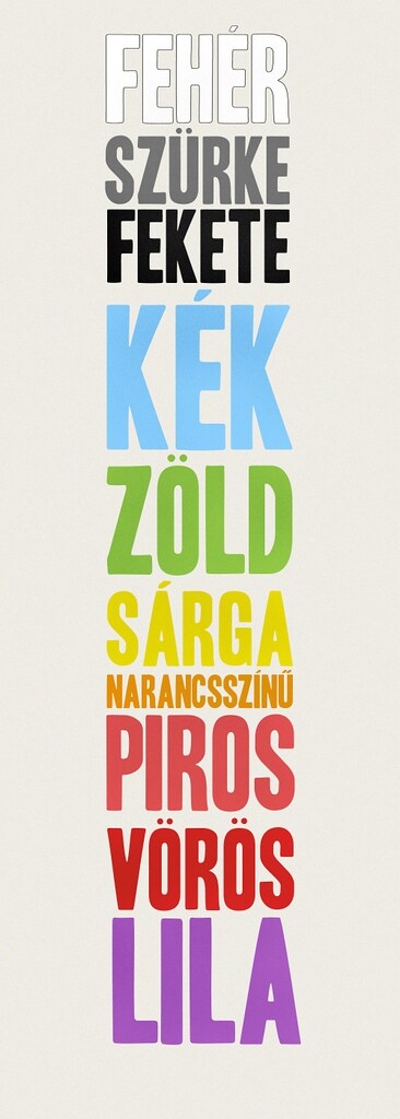
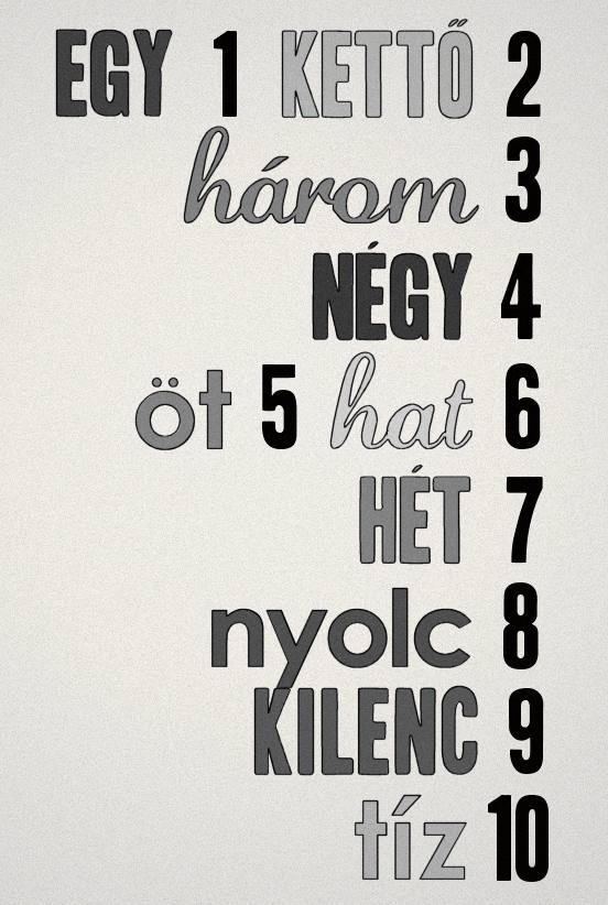
colors & numbers

Hungarian's got a reputation for being one of the hardest languages for English speakers to learn. For pretty good reason. I made these when I couldn't keep my colors and numbers straight...


(click on them to make them bigger)
Powered by Blogger.